Dr. Kanpo – Japanese Herbal Medicine Online Consultation
Dr. Kanpo was going to be launched as an online consultant service for people who use kanpo (漢方) - traditioal Japanese herbal medicine derived from ancient Chinese medicine practices. Kanpo is typically used in the form of teas, powders, capsules, or decoctions, combining natural ingredients to support overall well-being. It is often prescribed alongside modern medical treatments in Japan, focusing on balancing the body’s natural functions.
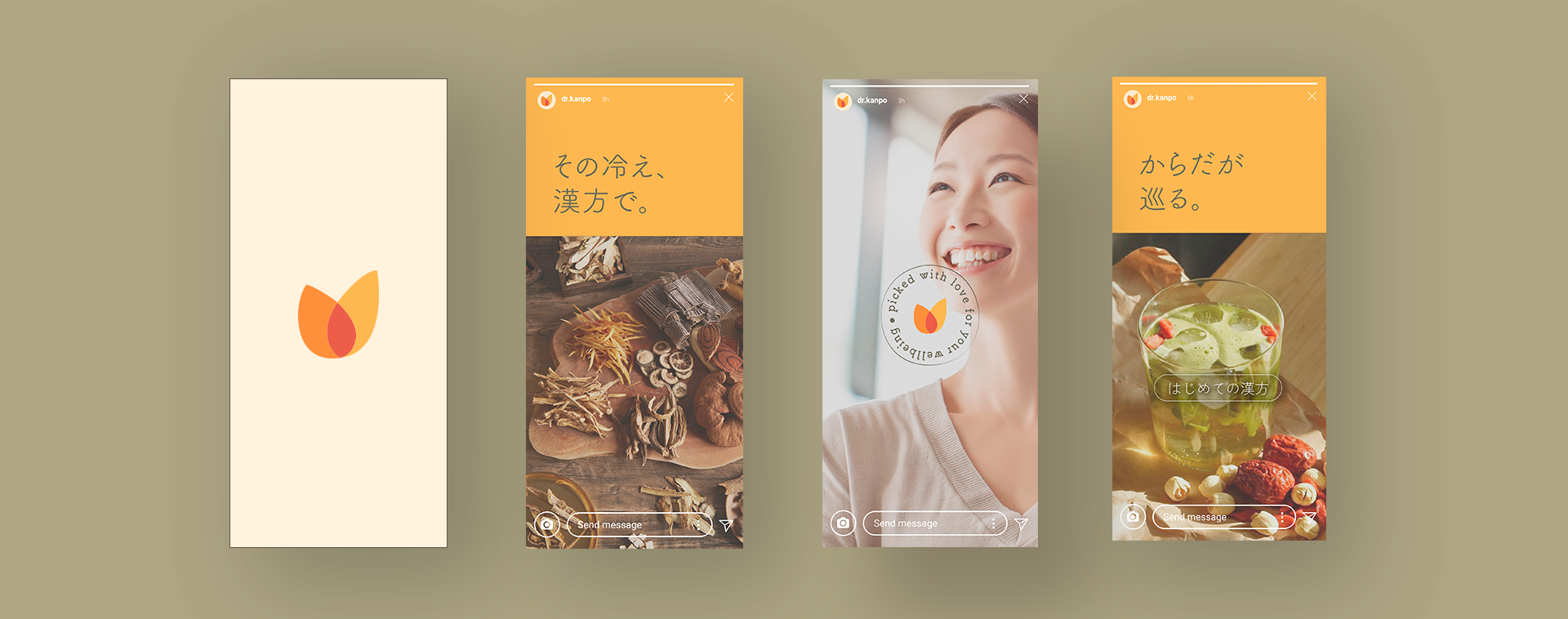
An online competition was held to select a new logo design for the new business, and the logo I created was chosen among others. After that, I challenged myself to continue developing its visual identity further. The primary audience is women, with an aim to also engage the younger generation, who frequently use digital platforms to gather information.
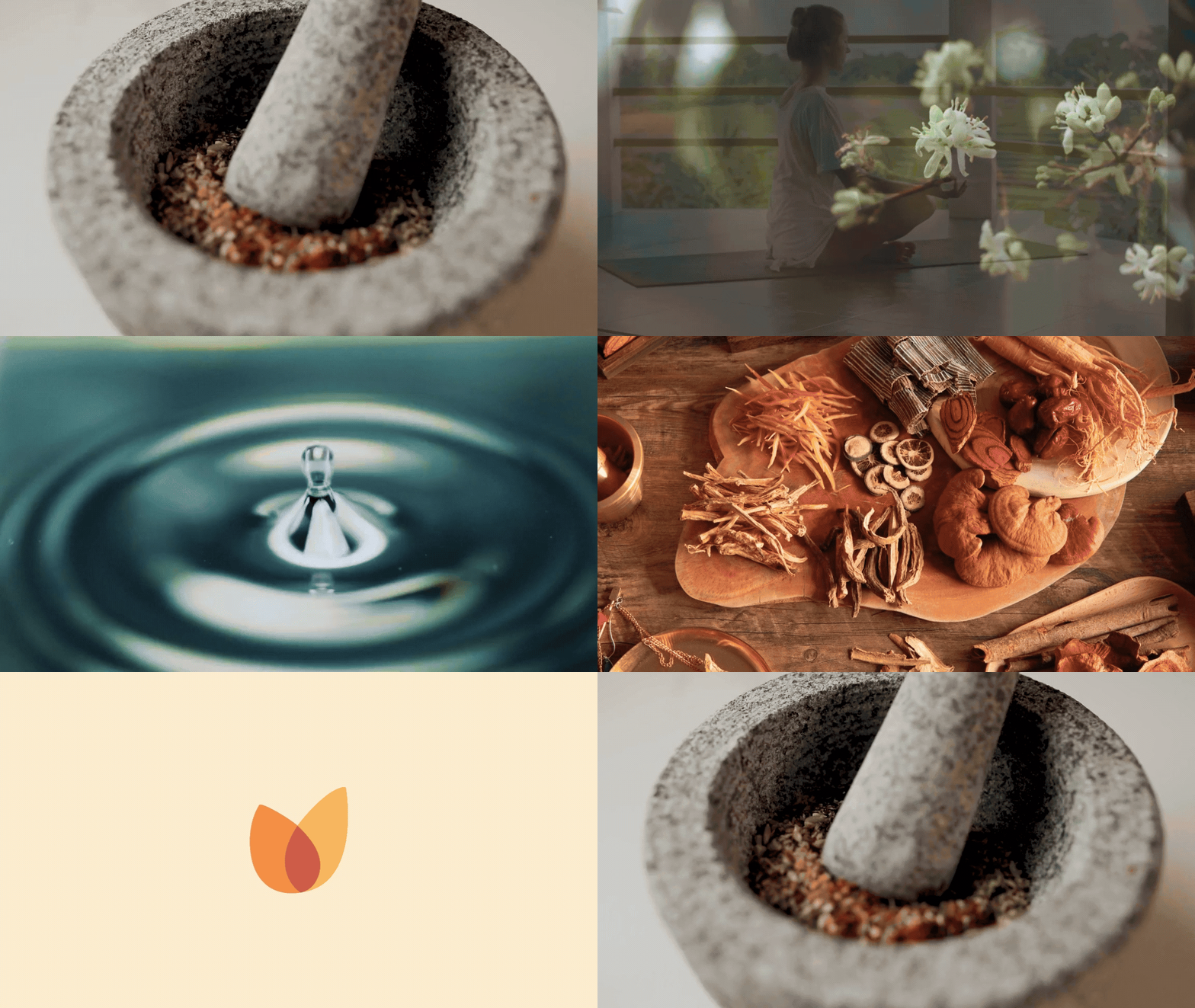
Dr. Kanpo stands at the intersection of tradition and modernity. My mission was to combine organic, human-centered design with strong evidence-based validation, ensuring Kanpo's credibility while highlighting the natural efficacy of its ingredients. By blending these elements, I aimed to create a design that reflects both an accessible, modern image and the integrity that today’s consumers expect from health products. The visuals — organic yet clean, warm yet professional — were crafted, with interactive information cards, to convey a visual identity that feels both rooted in tradition and forward-looking for the brand.

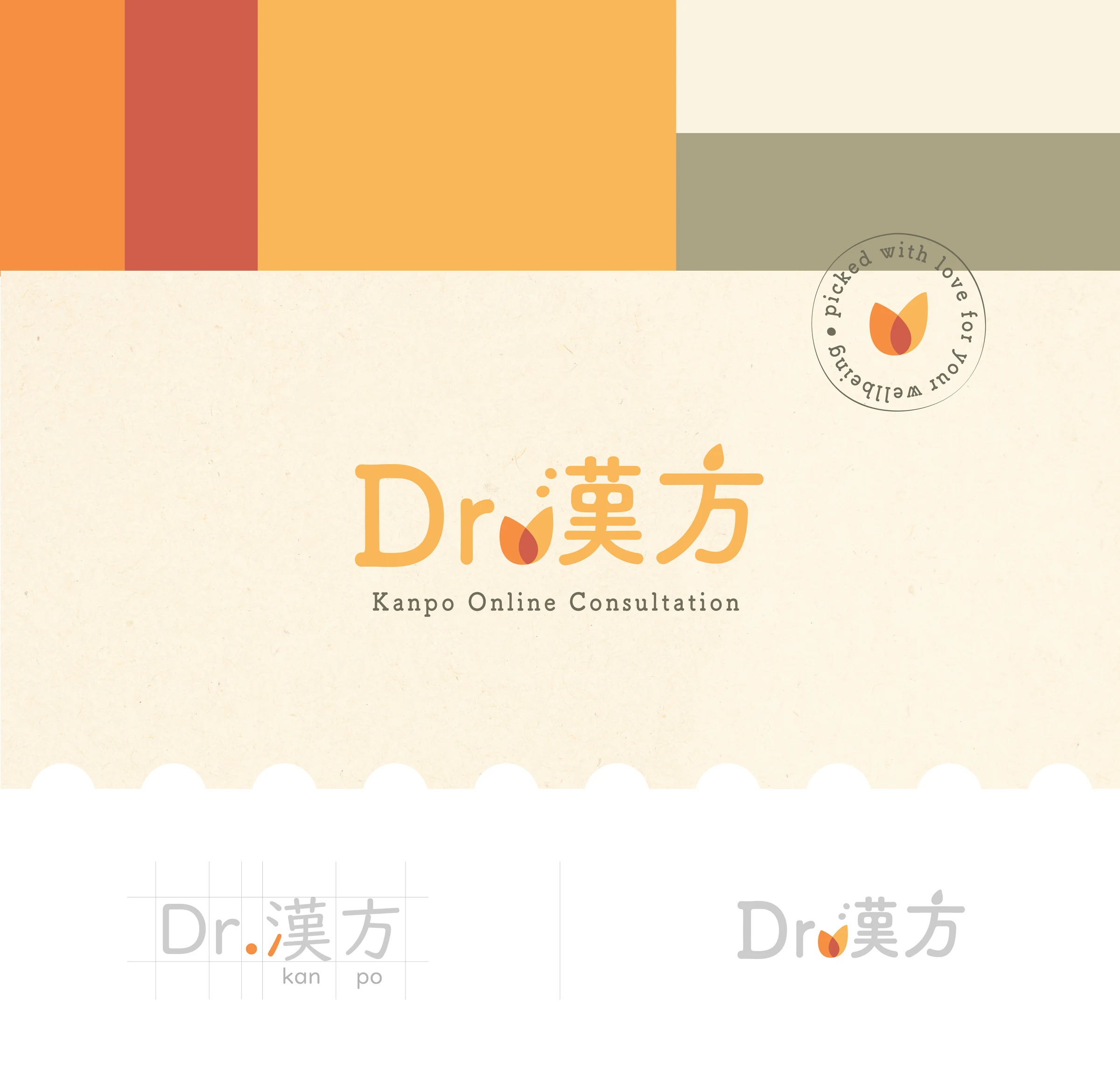
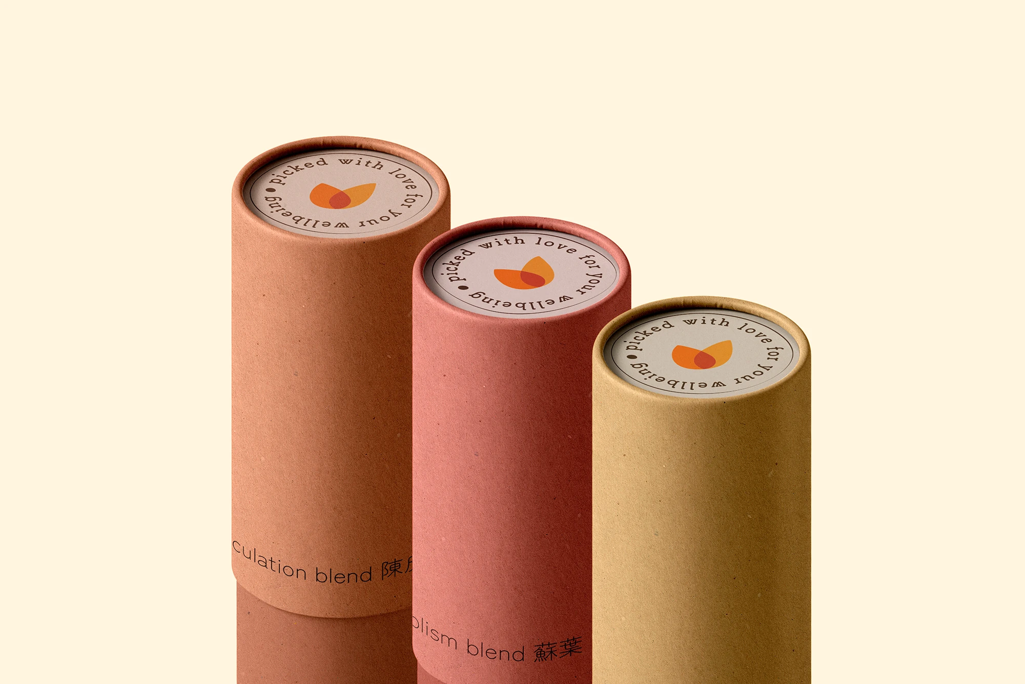
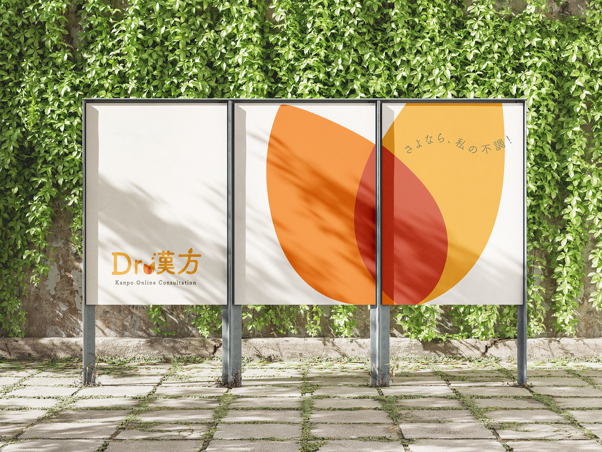
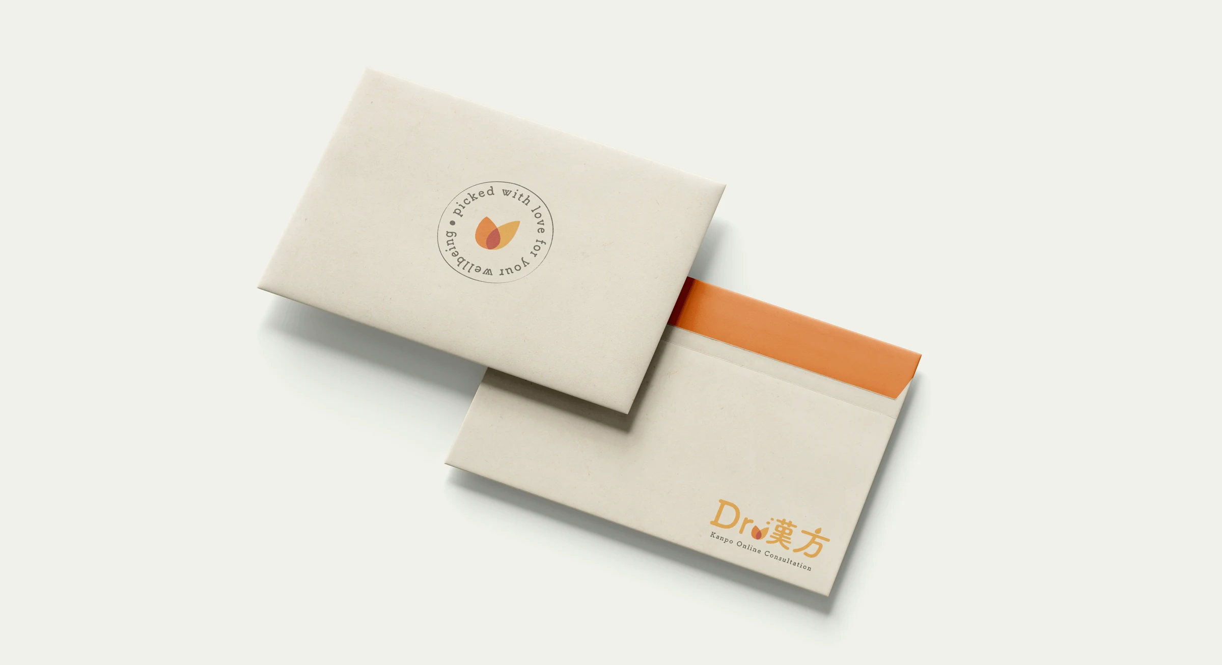
Warmth is central to Kampo and its role in supporting health and treating ailments. To express this philosophy, I developed a botanical-inspired symbol and integrated it into the Dr. Kanpo wordmark, where it replaces the dot and connects with the following character. Its forms draw on both flame and herb imagery, bringing warmth to a contemporary identity for online consultation. The symbol also works independently, maintaining recognition in applications where the full wordmark is not visible.

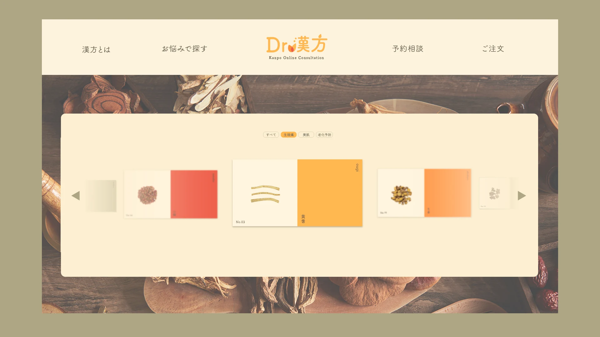

The use of botanical cards, paired with the science-inspired appearance of text in the animations, underscores Kampo’s evidence-based validation and addresses the challenge of demonstrating that traditional medicine can be scientifically validated as modern pharmaceuticals. This approach enhances reliability by presenting the brand’s message in a fun and modern yet trustworthy manner, to connect with the consumer.