
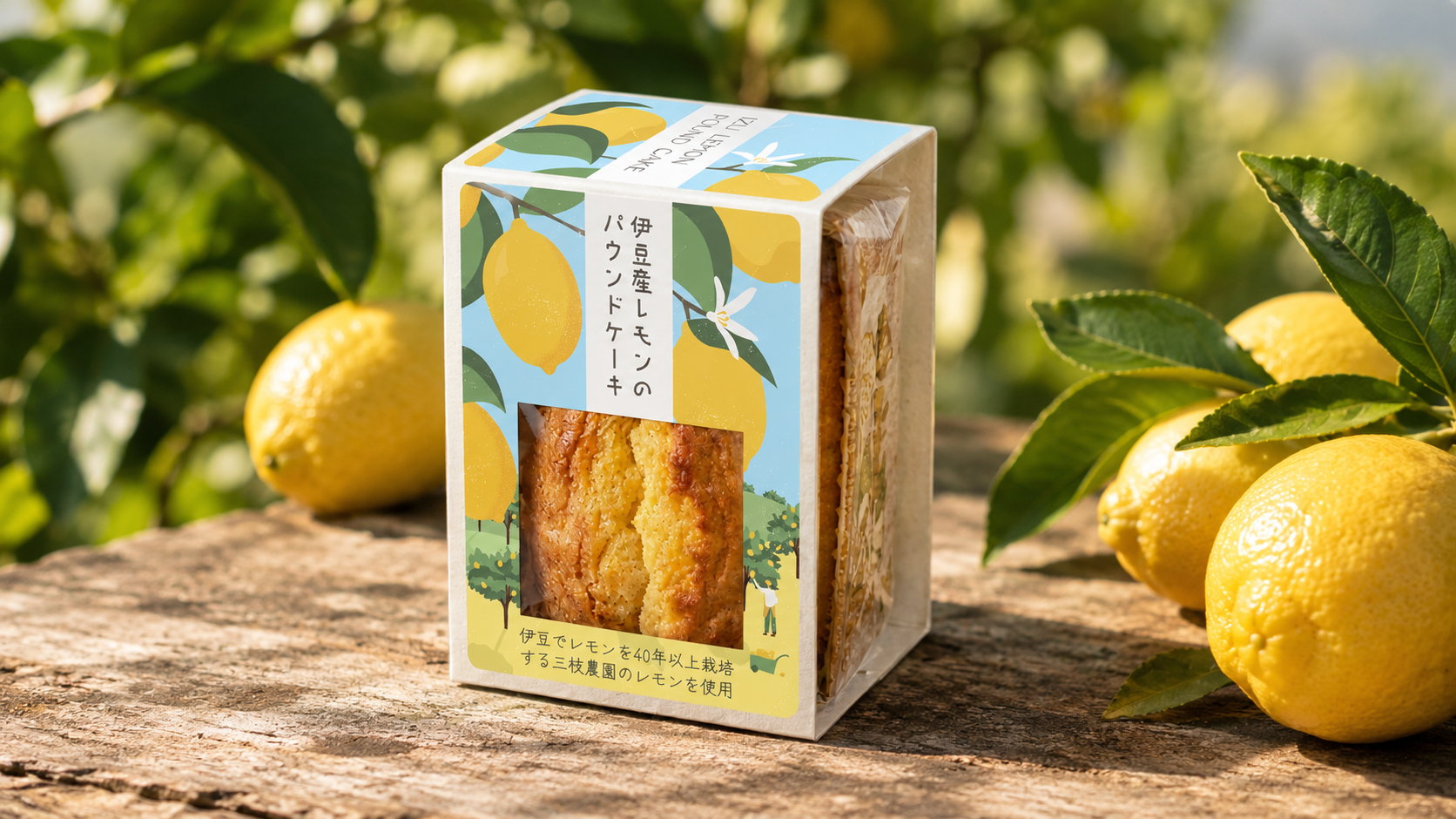
Izu Lemon Pound Cake
Translating Izu’s agricultural heritage into a contemporary packaging concept that balances handcrafted character, regional identity and everyday appeal.
Art direction and packaging design for a lemon pound cake made using locally sourced lemon peel from Izu, Japan. The project focused on creating a distinctive, thoughtfully crafted package that reflects the product’s local origins while remaining cost-effective and practical for retail.
Design Concept
The aim was to create a visual expression that feels natural, warm and handcrafted, while still appealing to a modern, design-conscious audience in the Kanto region.
A soft colour palette, organic hand-drawn illustrations and spacious typography bring together a relaxed, approachable aesthetic. The balance of playful details and clean layout gives the packaging a distinctive character without losing sight of the product’s local roots.
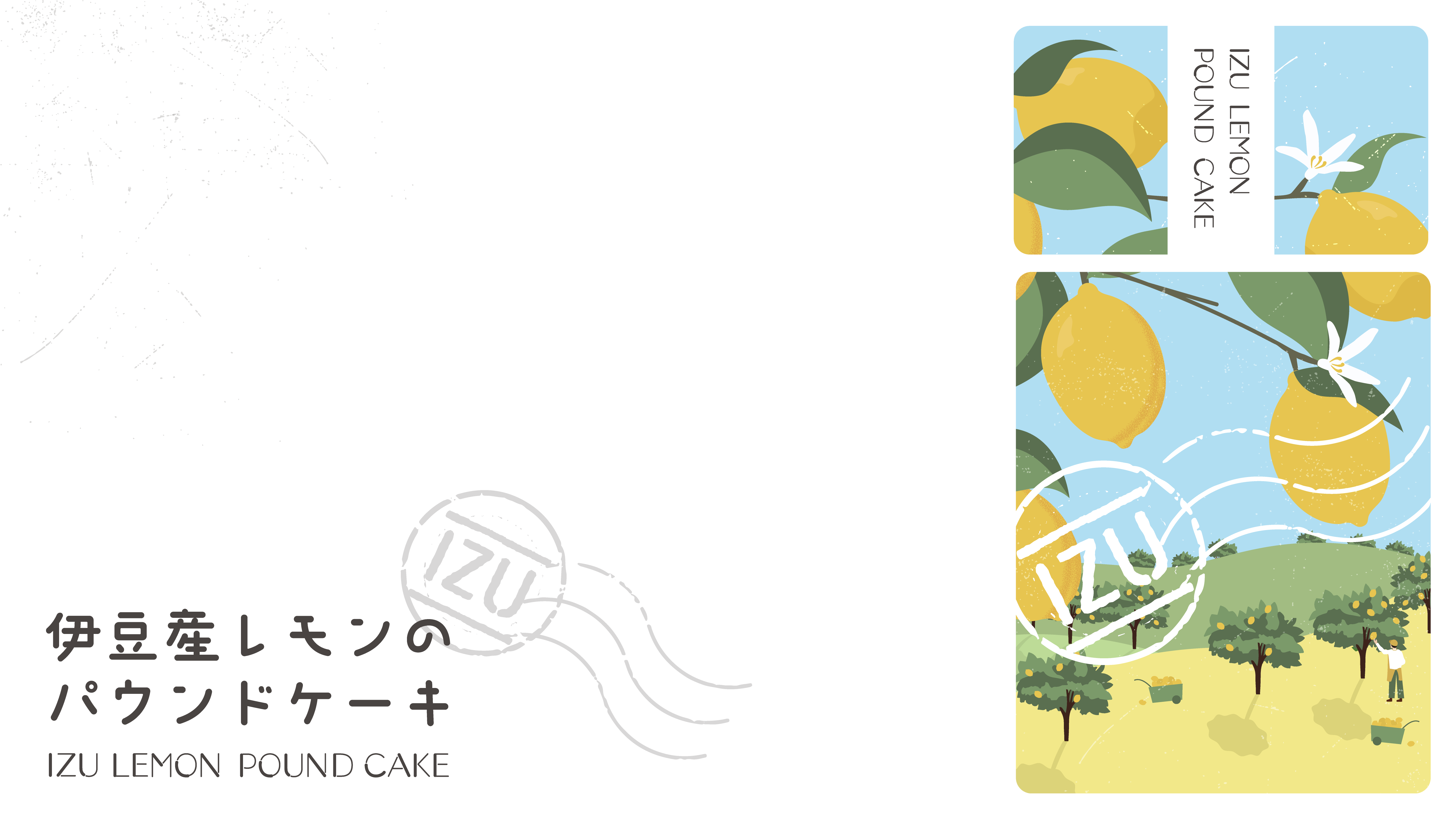
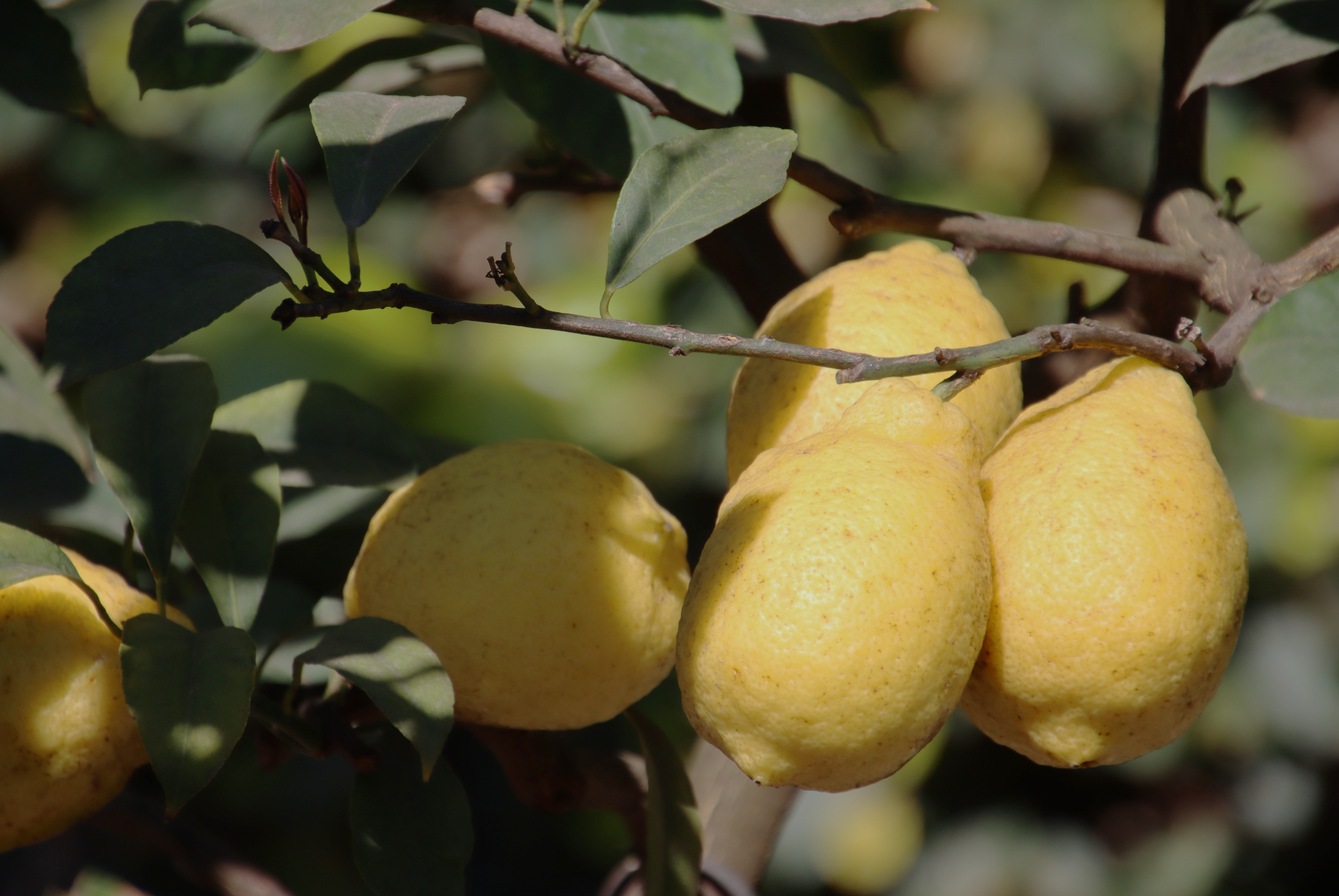
The visual direction combines soft colours, organic illustration and spacious typography to create a look that feels natural and handcrafted, yet fresh and approachable. Inspired by Izu’s lemon farms and local landscape, the design brings a sense of place to the packaging while appealing to a modern, design-conscious audience. A postmark-inspired emblem reinforces the regional identity, giving the product the feel of a small parcel from Izu.
Packaging Design
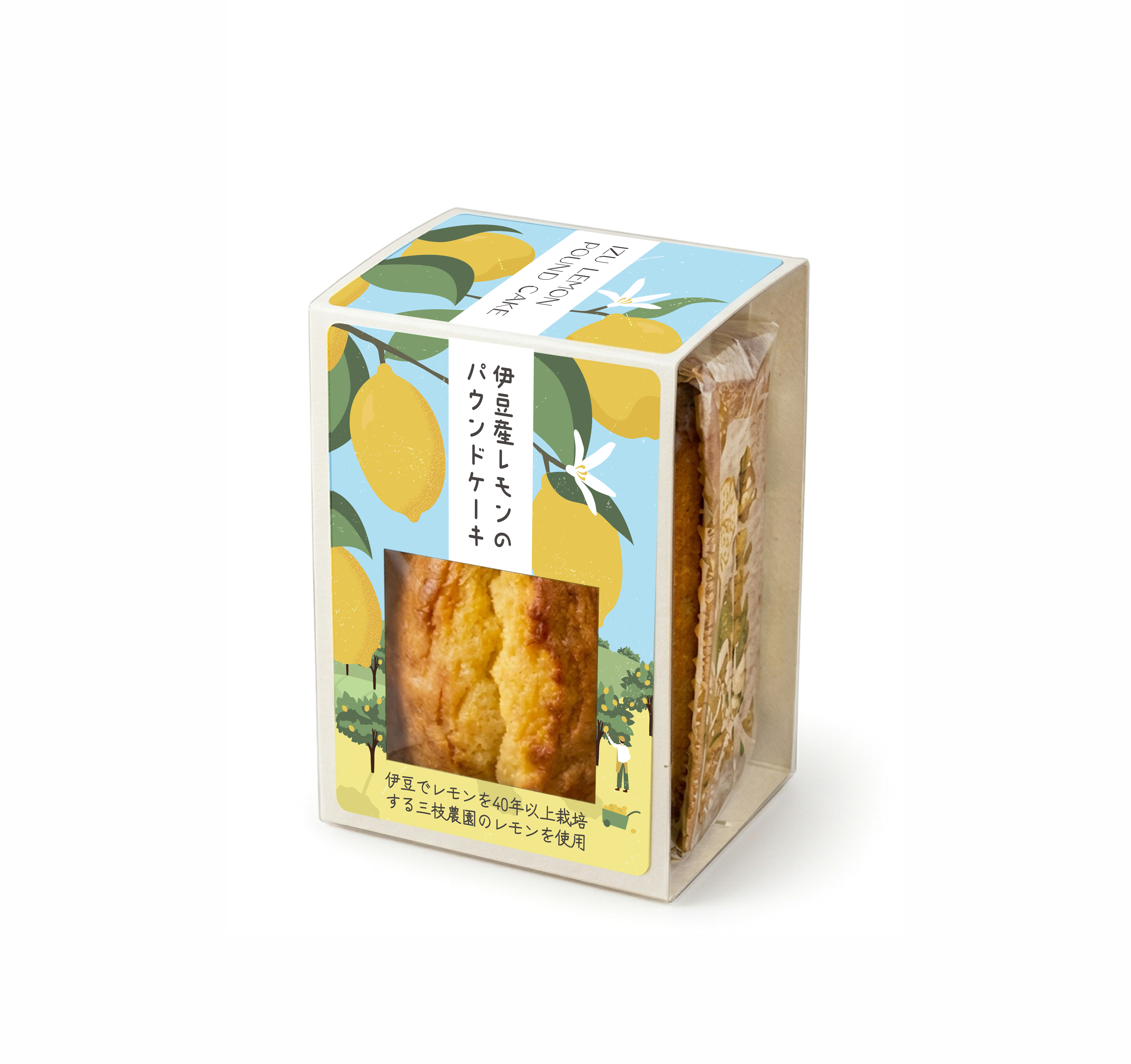
The client initially considered a simple sticker applied directly to the plastic packaging. I proposed a paper sleeve as an alternative, offering a more considered presentation without the added cost of a separate box. The sleeve adds structure and character while keeping the packaging simple. A postmark-inspired IZU emblem references traditional postal stamps, creating the impression of a product sent directly from the region.
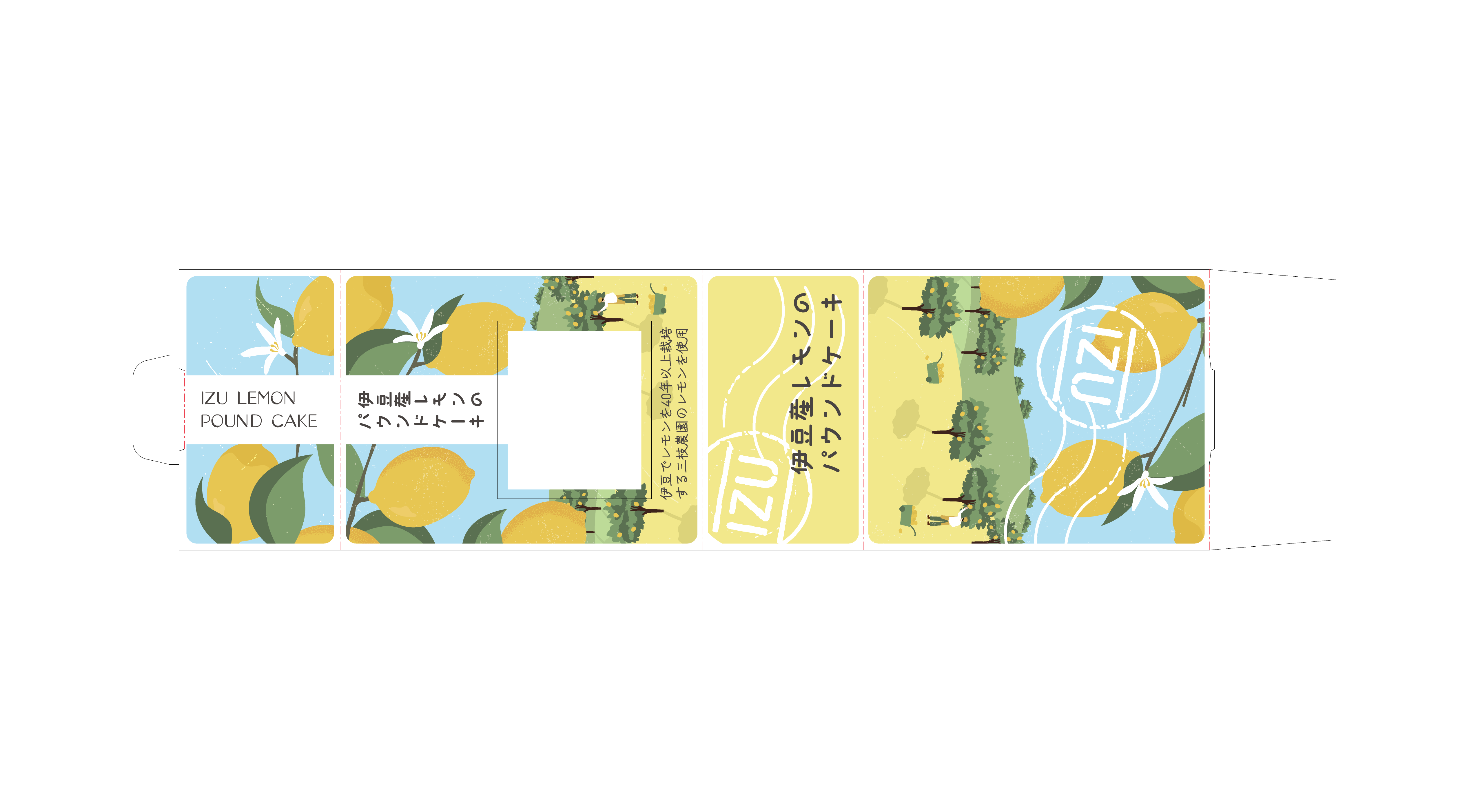
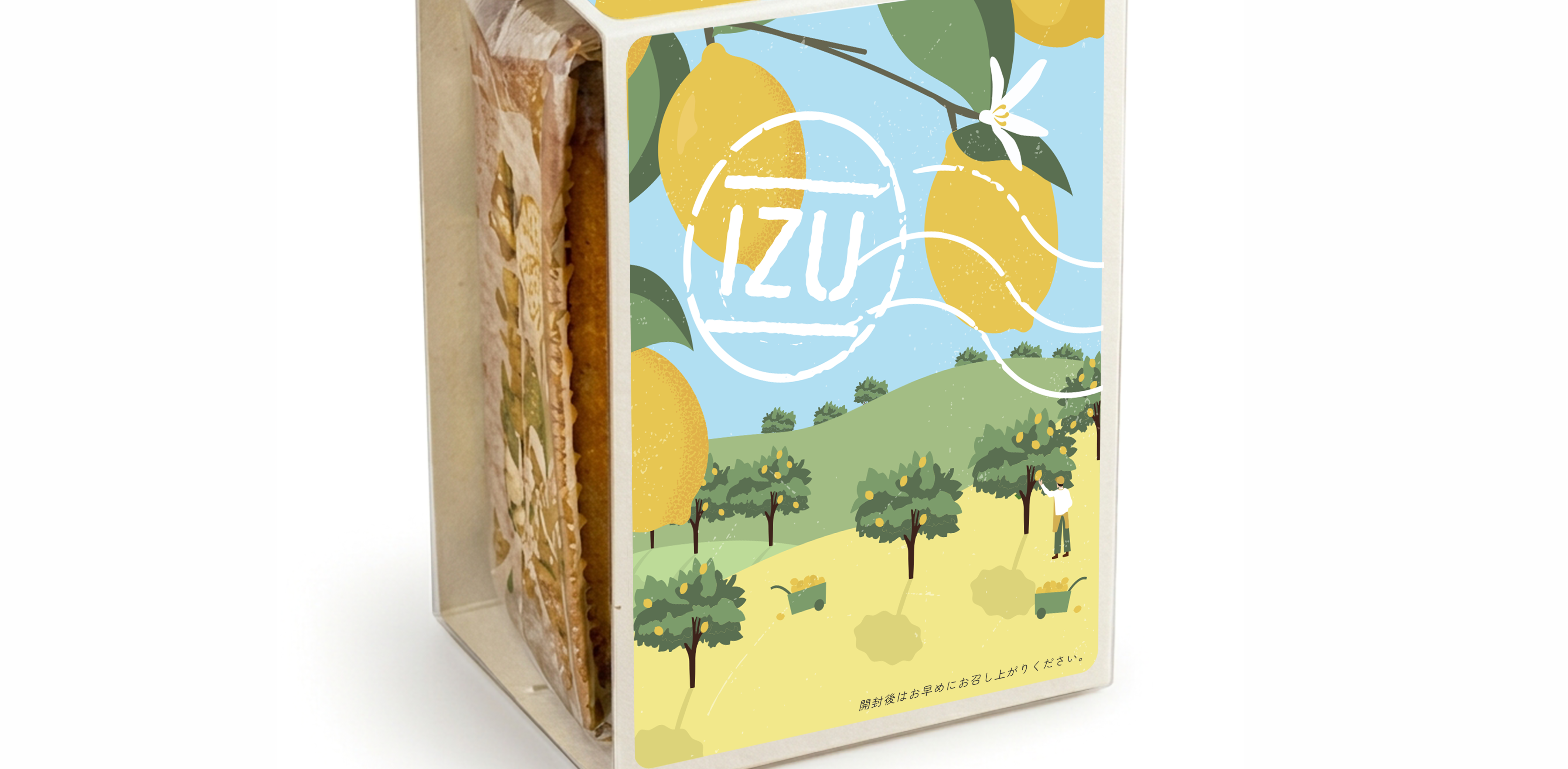
Illustration & Details
The custom illustration depicts a lemon farm and its surrounding landscape, bringing a human touch to the design and highlighting the connection between the product and its place of origin. The packaging also reflects the client’s approach to making the most of local produce. Lemon peel left over from the production of other products is reused in the cake, giving an existing ingredient a new purpose.
Designed for Retail
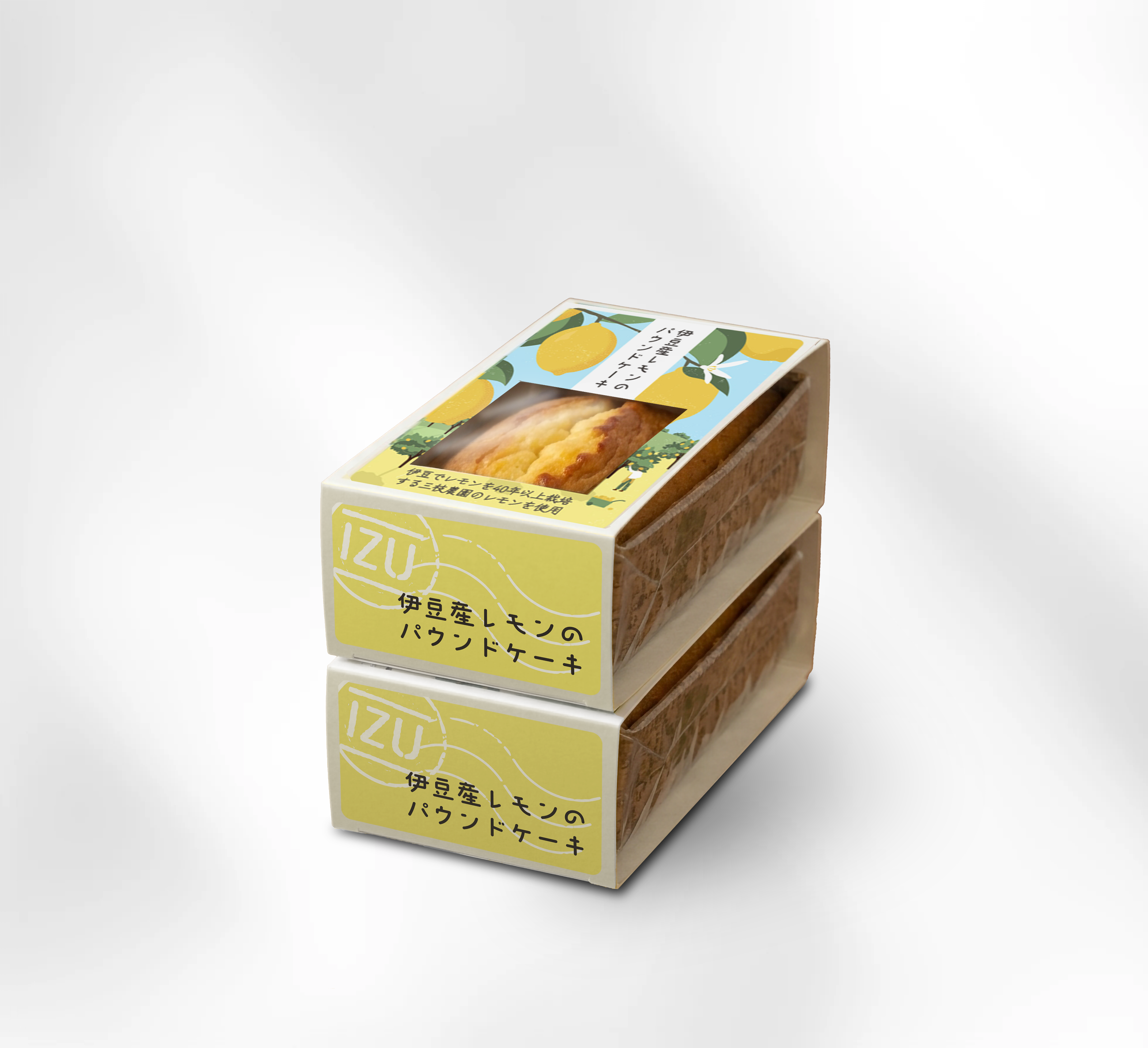
Sold in shops alongside a variety of regional products, the cake needed to remain identifiable when displayed stacked. The product name is positioned along the bottom of the sleeve so it remains visible even when the packages are stacked.
Thank you.
Adobe Illustrator