
Serene Flow yoga studio identity on a teal gradient background
Serene Flow — Yoga Studio
Visual Identity
Web Design
Digital Experience
Concept Project

A Calmer Approach to Digital Wellness

Serene Flow is a conceptual yoga studio brand exploring the relationship between visual identity and digital experience. The project translates the studio’s emphasis on mindful movement and well-being into a cohesive visual language and responsive website design, balancing clarity, warmth, and simplicity.

01 · Digital experience

Finding a calmer rhythm online

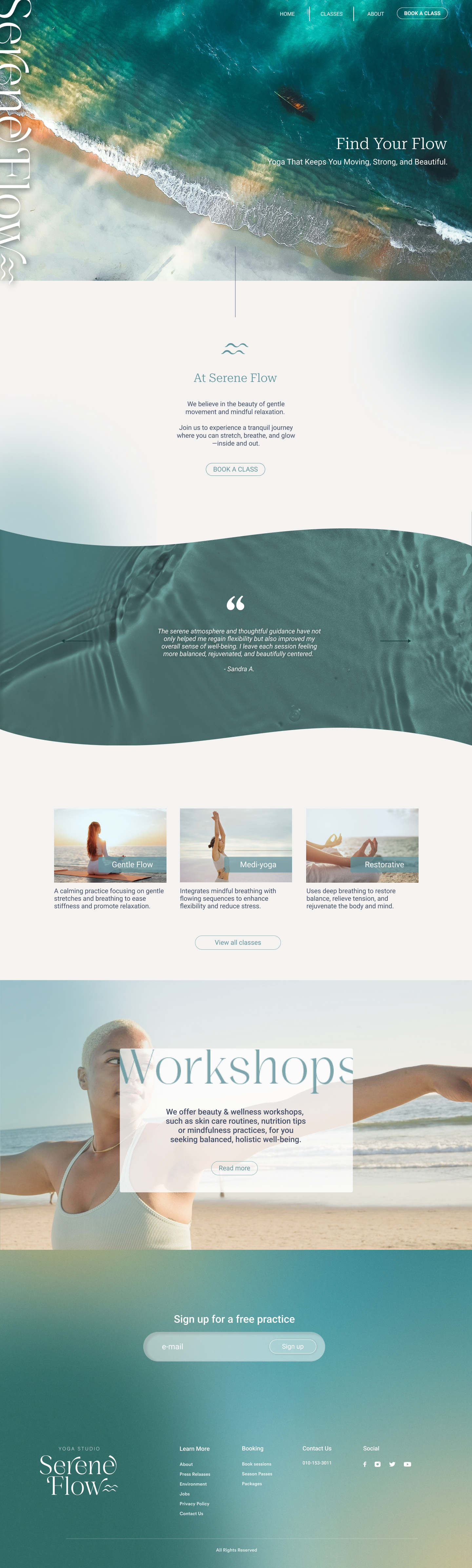
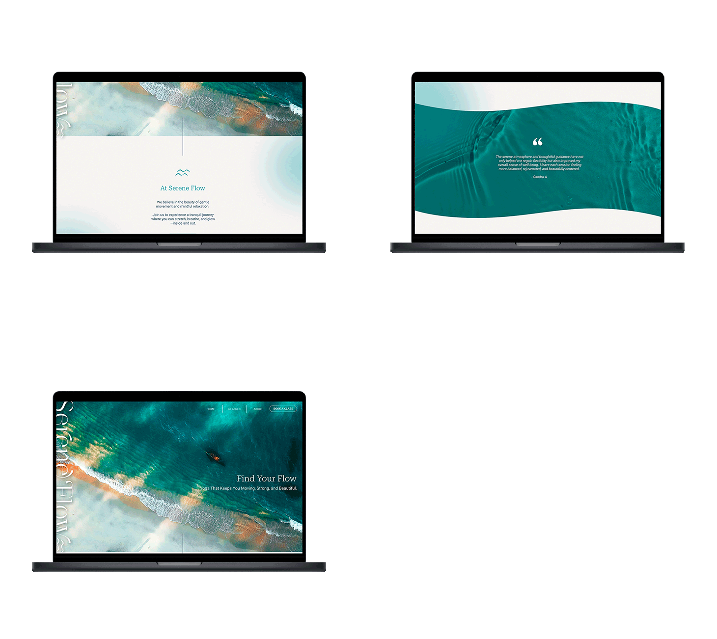
The homepage pairs spacious layouts with a flowing teal palette and ocean imagery, creating a tranquil first impression while keeping classes and studio information easy to find.

Animated Serene Flow website shown on a laptop

02 · Visual direction

Colour, imagery and atmosphere

High-quality photographs of gentle yoga poses in natural settings, rather than studios, bring warmth and human presence to the identity. Soft lighting and a matching gradient colour palette create a serene, restorative atmosphere.

Serene Flow visual study featuring a yoga pose and wave mark

03 · Type and colour

A quiet, consistent system

Inspired by water, the colour palette uses soft, natural tones to create a sense of tranquillity. Gentle blues and greens reflect the fluidity of movement, while warm neutrals ground the design. Together, they create a welcoming, restorative visual space.
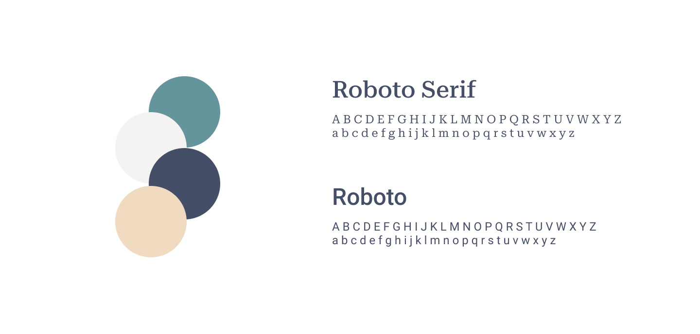
Serene Flow typography and colour palette study

04 · Responsive design

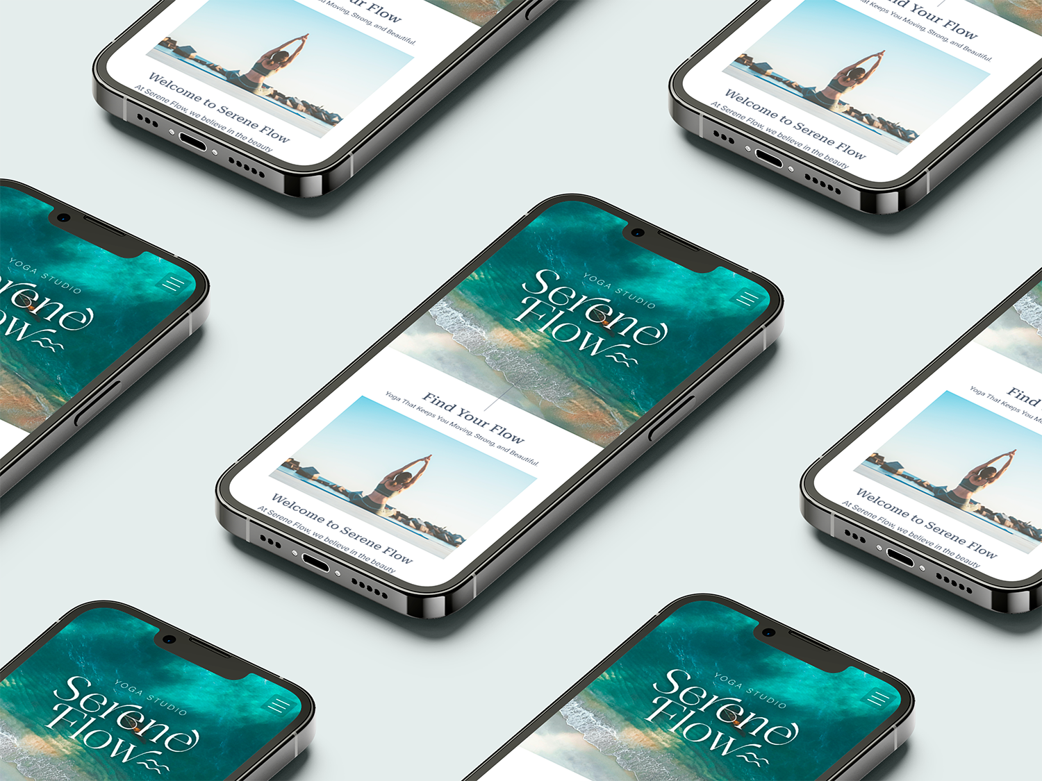
Designed for a smaller screen

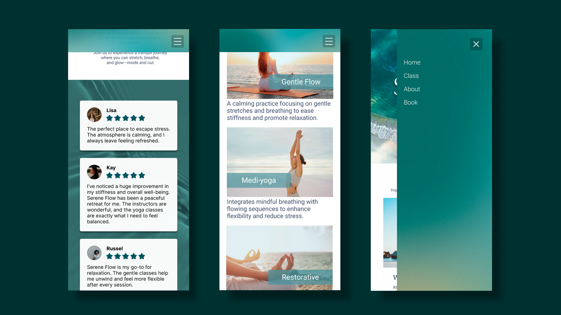
Serene Flow mobile website mockup shown across smartphones

05 · Website concept

A complete journey through the studio

Full-page Serene Flow yoga studio website concept
Serene Flow mobile interface screens for classes and navigation
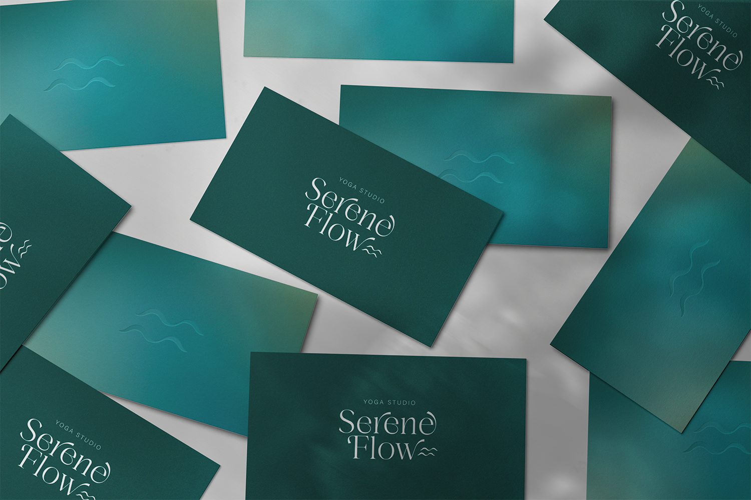
Serene Flow business card identity mockup
Serene Flow room mist product mockup
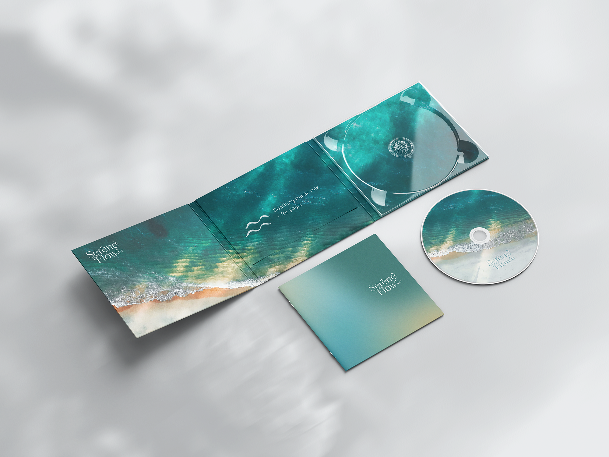
Serene Flow calming music mix digipack and CD mockup
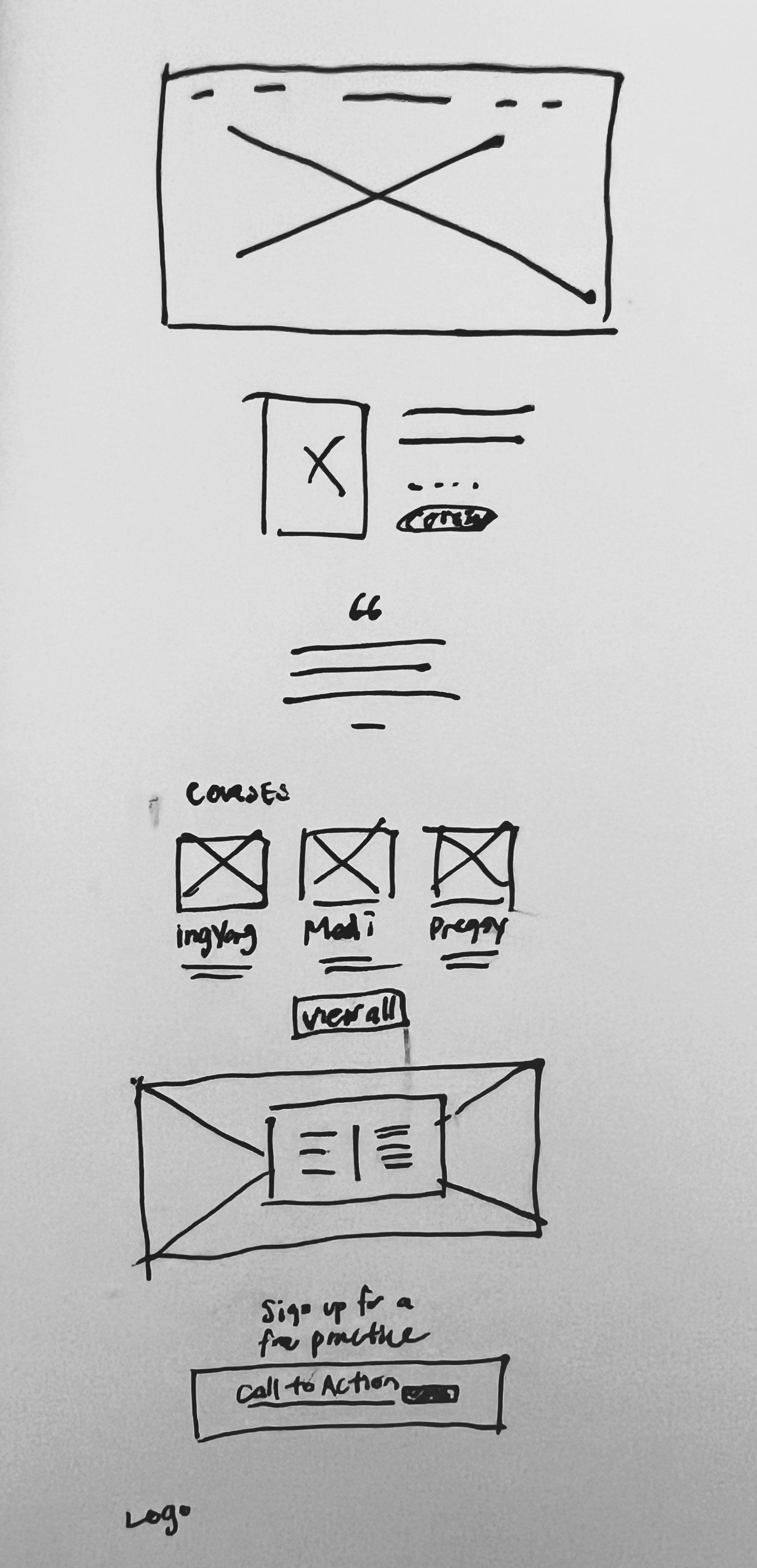
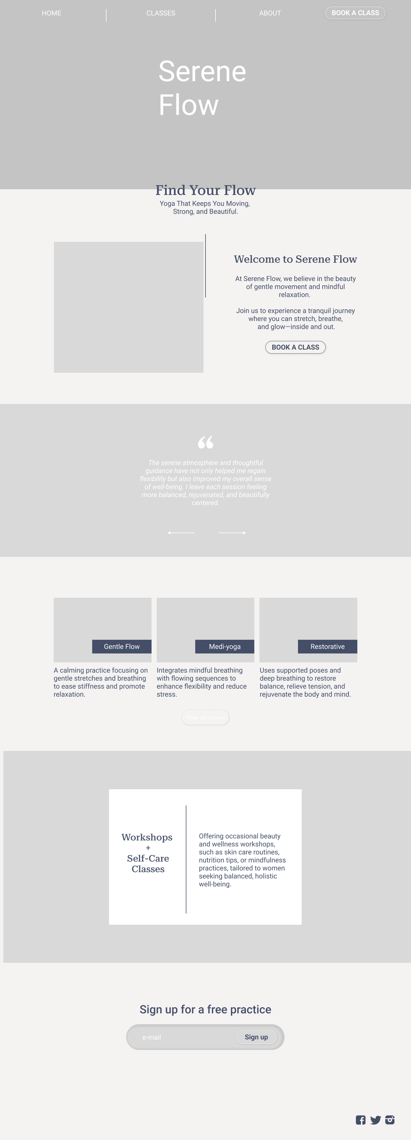
Early hand-drawn wireframe for the Serene Flow websiteLow-fidelity Serene Flow website wireframe

08 · Process

Wireframes & low-fidelity design

Call to action: a clear first step
I began with hand-drawn wireframes, then developed a low-fidelity layout to test the page structure and hierarchy. The booking call to action appears early for visitors ready to book, while the rest of the page builds context at a calmer pace.

Thank you.