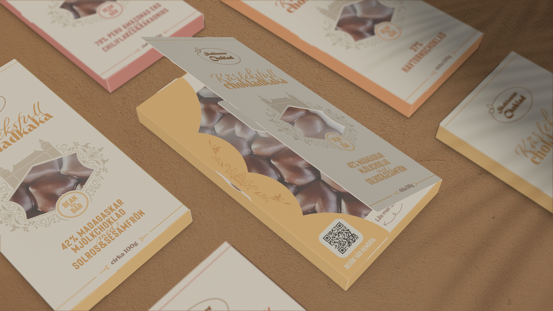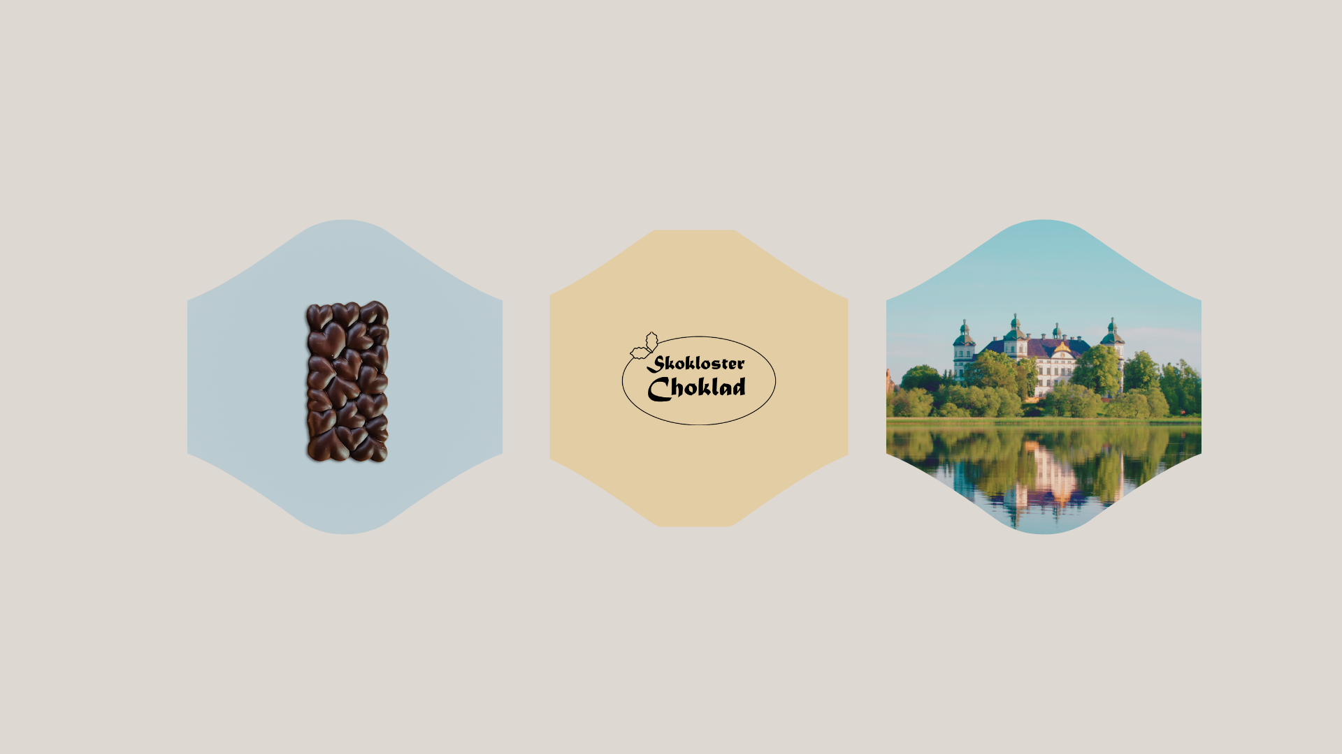
Left: a beautiful chocolate bar with heart shapes.
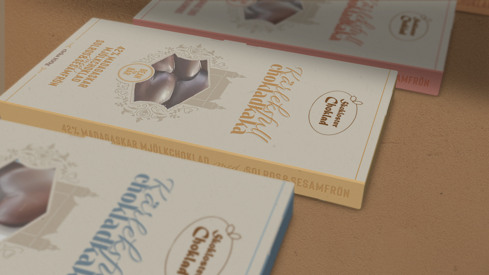
Center: the brand logo (not part of the project).
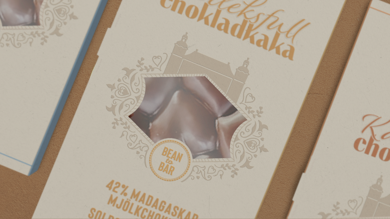
Right: the well-known castle in the region.
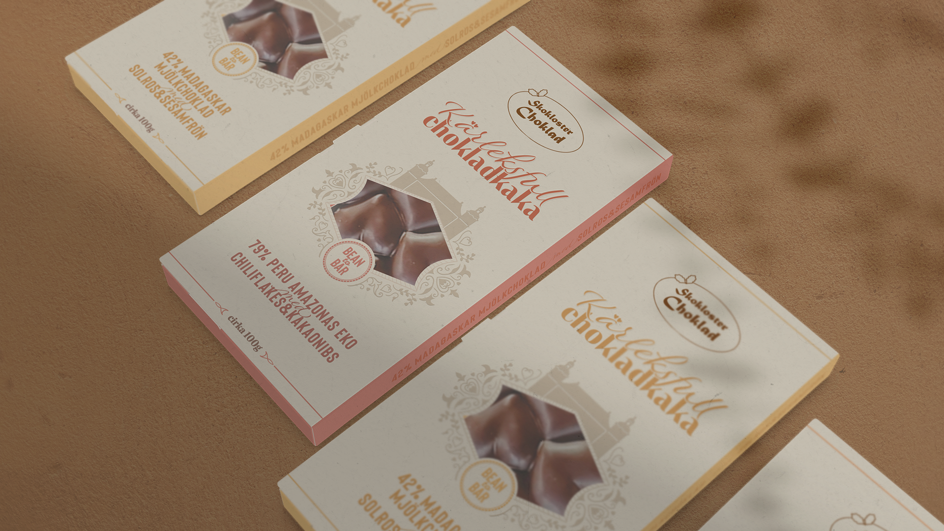
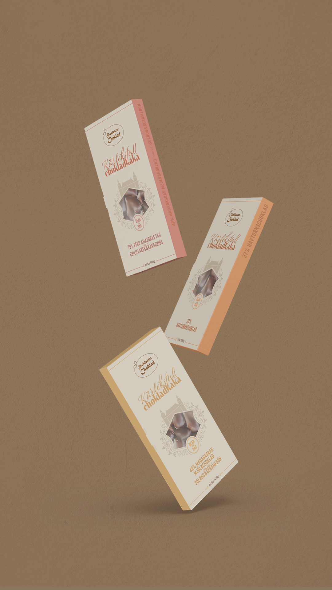
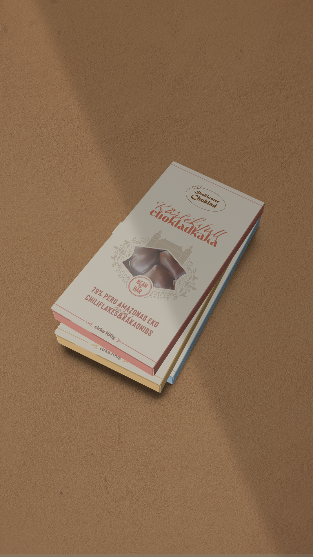
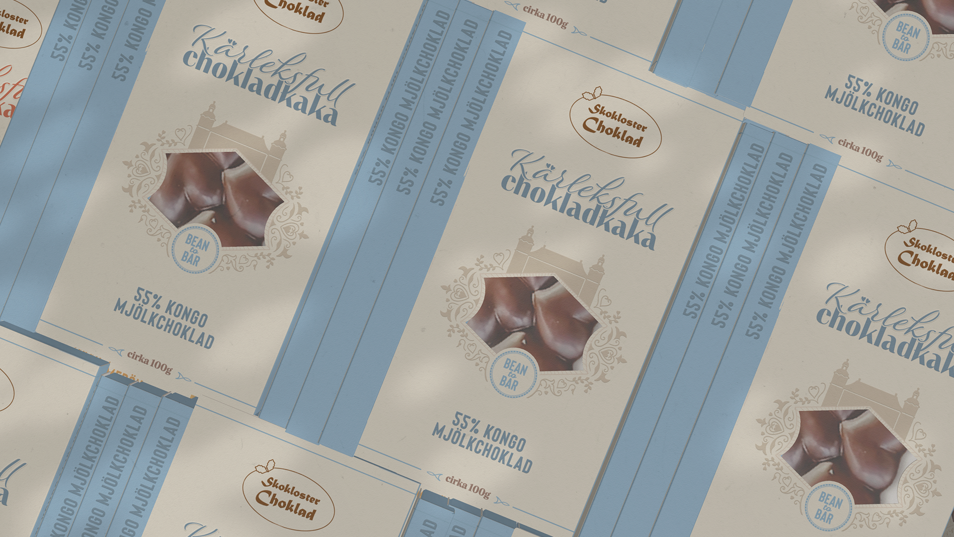
Kärleksfull Chokladkaka was a redesign project for chocolate bar packaging with five flavors, undertaken as part of my Packaging Developer/Designer program. The goal was to create paperboard packaging that reflected the brand's values, the bean-to-bar process, and clearly differentiated the flavors. My report outlines the design process, supported by various analyses to identify key design elements.
The client preferred a formal, classic aesthetic with an illustration of the nearby castle. Although my analyses showed a trend toward more organic designs, I balanced the client's vision with market demands. Through strategic design and communication, I created a design that met both their preferences and current trends, emphasizing the brand's sustainability, craftsmanship, and premium quality.
Left: a beautiful chocolate bar with heart shapes.
Center: the brand logo (not part of the project).
Right: the well-known castle in the region.
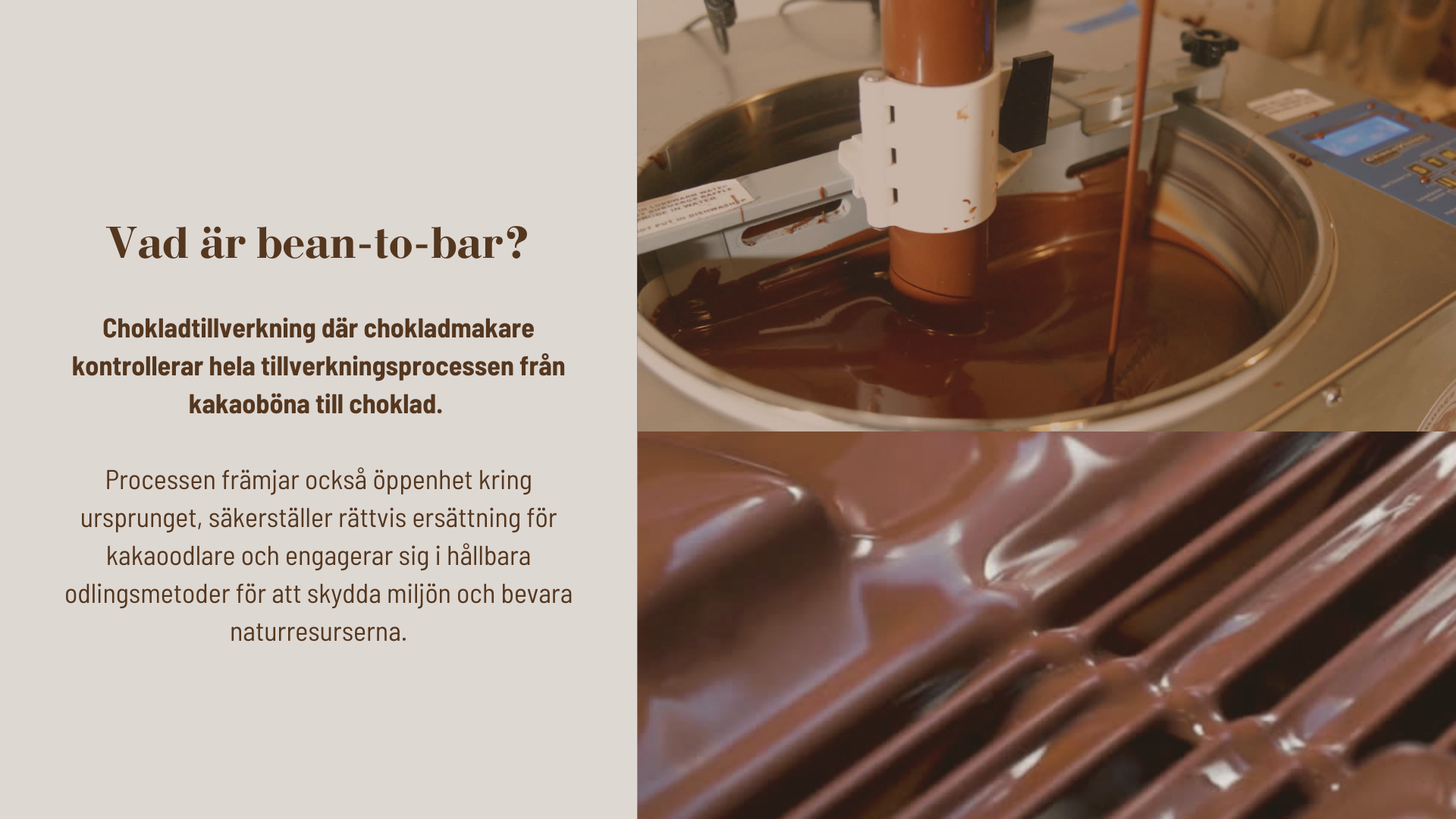
Bean-to-bar is a production method where the chocolate maker controls every step of the process, from sourcing the cocoa beans to crafting the final product, ensuring high quality and traceability.
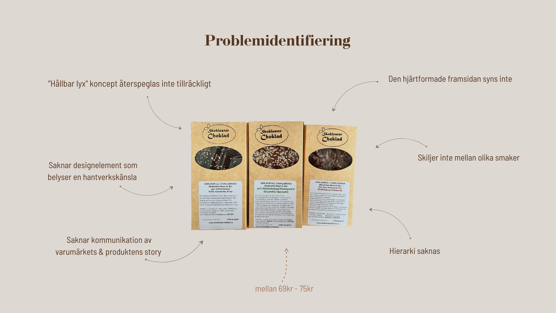
The company's concept of "sustainable luxury" is not adequately reflected, and the packaging design does not convey a luxurious feel. The packaging lacks design elements that highlight craftsmanship, and fails to create an emotional connection or include any brand storytelling. Additionally, it does not show the heart-shaped front of the chocolate bar, making it harder to distinguish between different flavors. The company decided to show the backs of the bars with sprinkles, although this can be resolved through graphic design.
To determine what should be emphasized on the packaging, I listed the Unique Selling Points and analyzed how they should be highlighted.
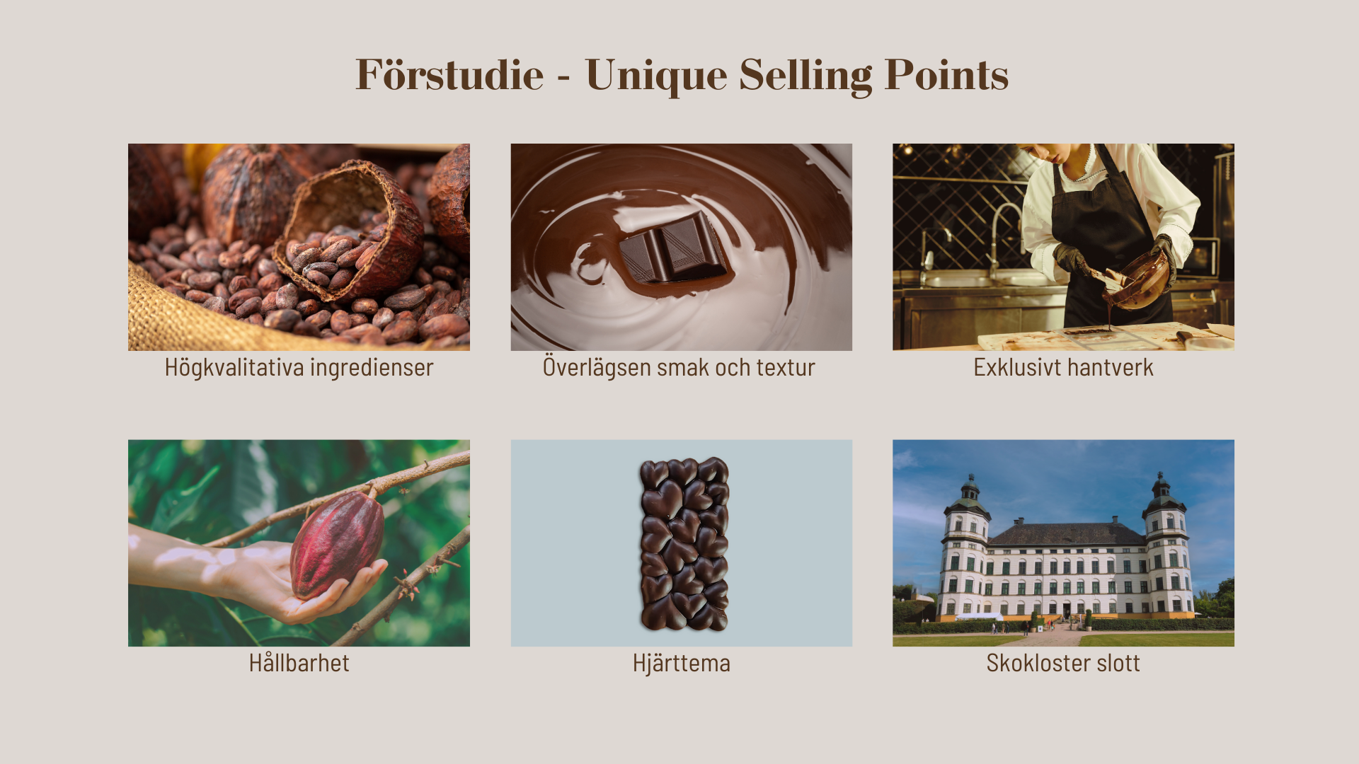
High-quality ingredients can be guaranteed with the term "bean to bar," so this should be emphasized on the packaging.
Superior taste and texture can be highlighted by associating the product with luxury. The packaging should reflect this in a clean and sophisticated graphic design.
Exclusive craftsmanship can be emphasized through detailed graphic design and thoughtful construction details.
Sustainability should be conveyed through the choice of packaging materials and earthy colors. "Bean to bar" also implies a sustainable choice.
The heart-shaped chocolate bar should be showcased through a window. I did not make it a main theme because emphasizing hearts in the design may associate the product with Valentine's Day and limit sales.
The castle is integral to the brand's identity, as most of its products are produced and sold nearby. While the client requested a castle illustration, I ensured it was incorporated in a way that met their expectations and aligned with the overall brand storytelling.
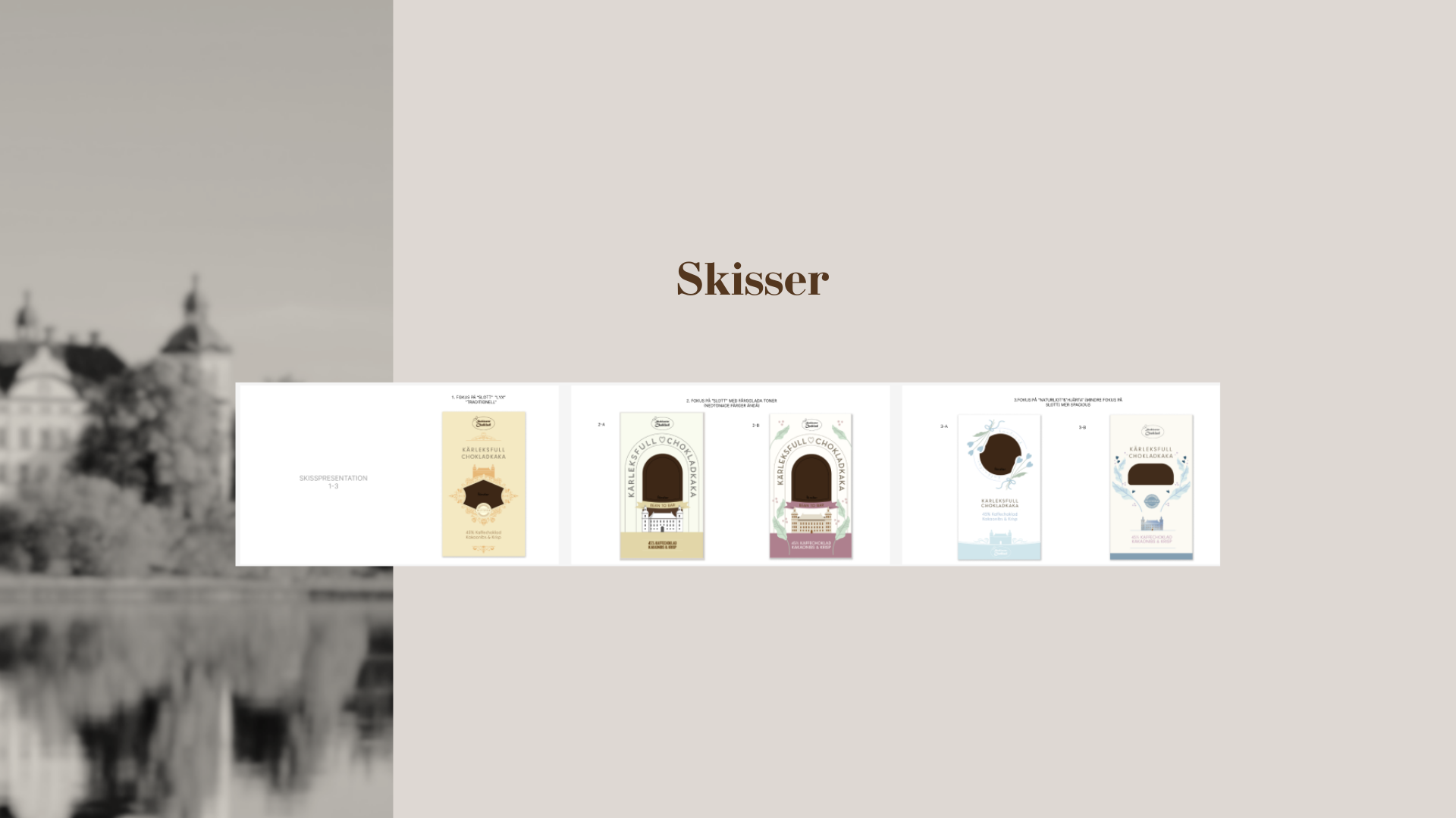
Insights from the Report
After the client selected one of the proposed design paths, they requested that I add a specific image to the mood board. I revised it accordingly, incorporating their input.
Insights from the Report
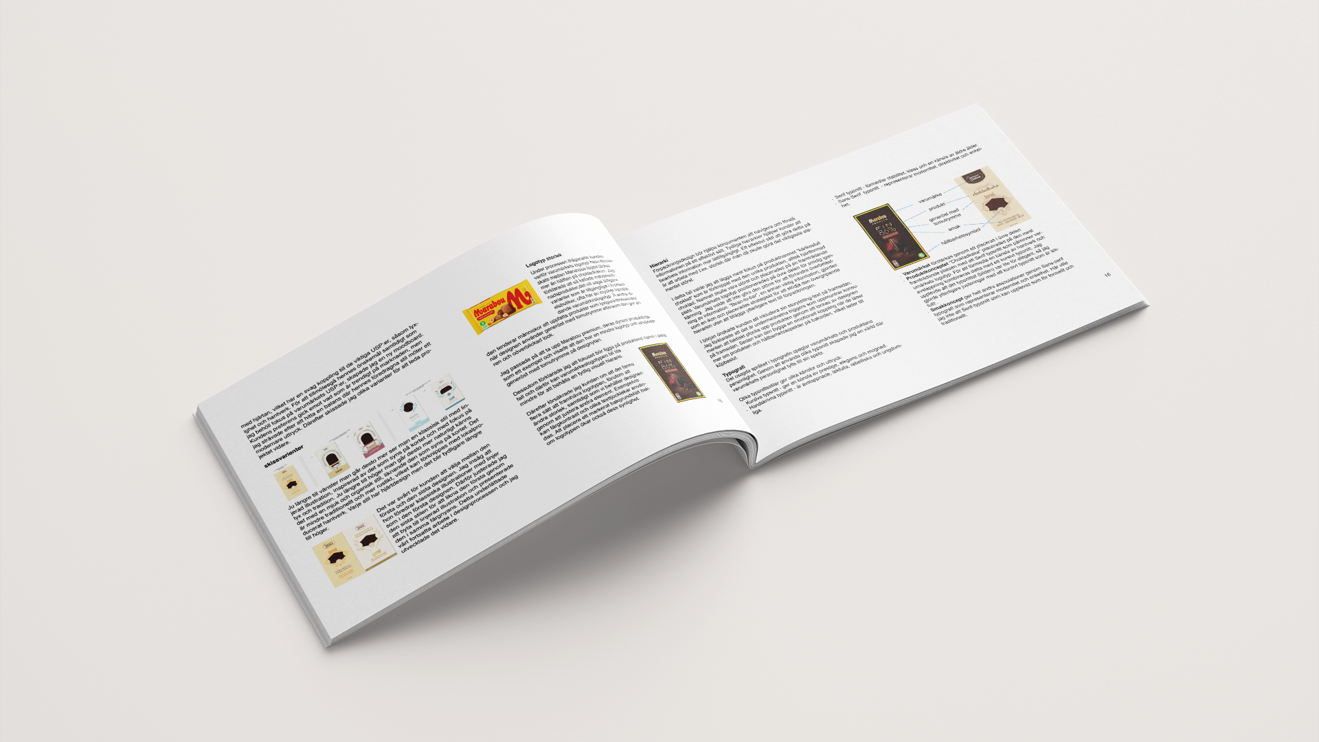
The client questioned why we didn't cover half the packaging with the brand logo, as seen on a Marabou bar. I explained the role of negative space and hierarchy in premium design, using Marabou's premium line as an example, and assured them the logo would stand out without being oversized.
Insights from the Report
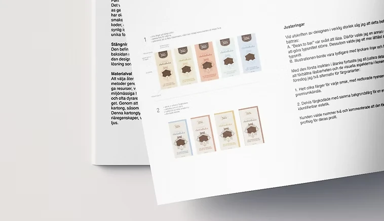
Two options were presented to the client, and they selected the second approach:
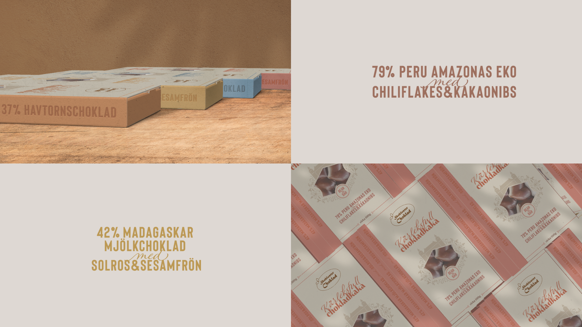
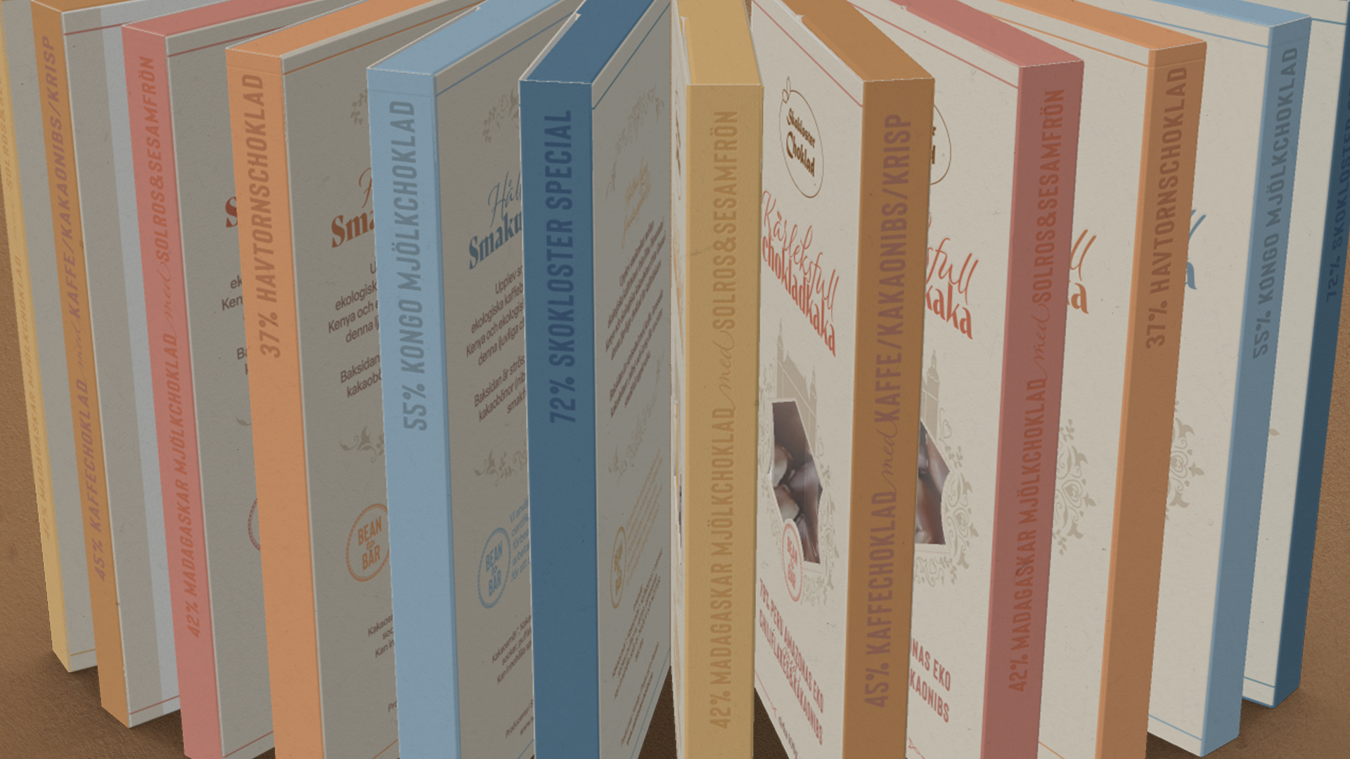
1. Completely distinct colors for each flavor, using muted tones to evoke a premium feel.
2. Partially color-coded with a consistent background for a cohesive, recognizable look.
Insights from the Report
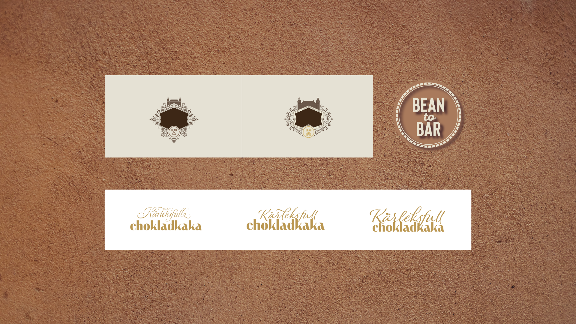
For "Chokladkaka," I chose a serif font reminiscent of the brand's logo. However, relying solely on this font might convey an overly stiff impression. To counterbalance this effect, I tested combining it with several script fonts.
Insights from the Report
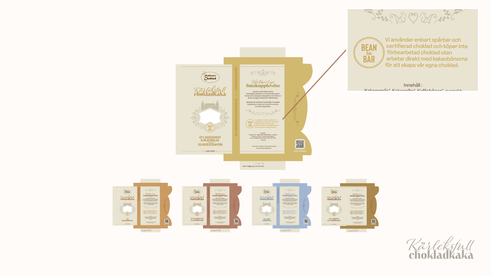
The back is generously used as a communication area to convey the brand's story, reinforcing the concept of "sustainable luxury" by highlighting craftsmanship and ethical sourcing. The bean-to-bar symbol stands out in color on the front, and the same symbol is placed on the back, encouraging consumers to engage further with the production process and understand the value behind each bar.
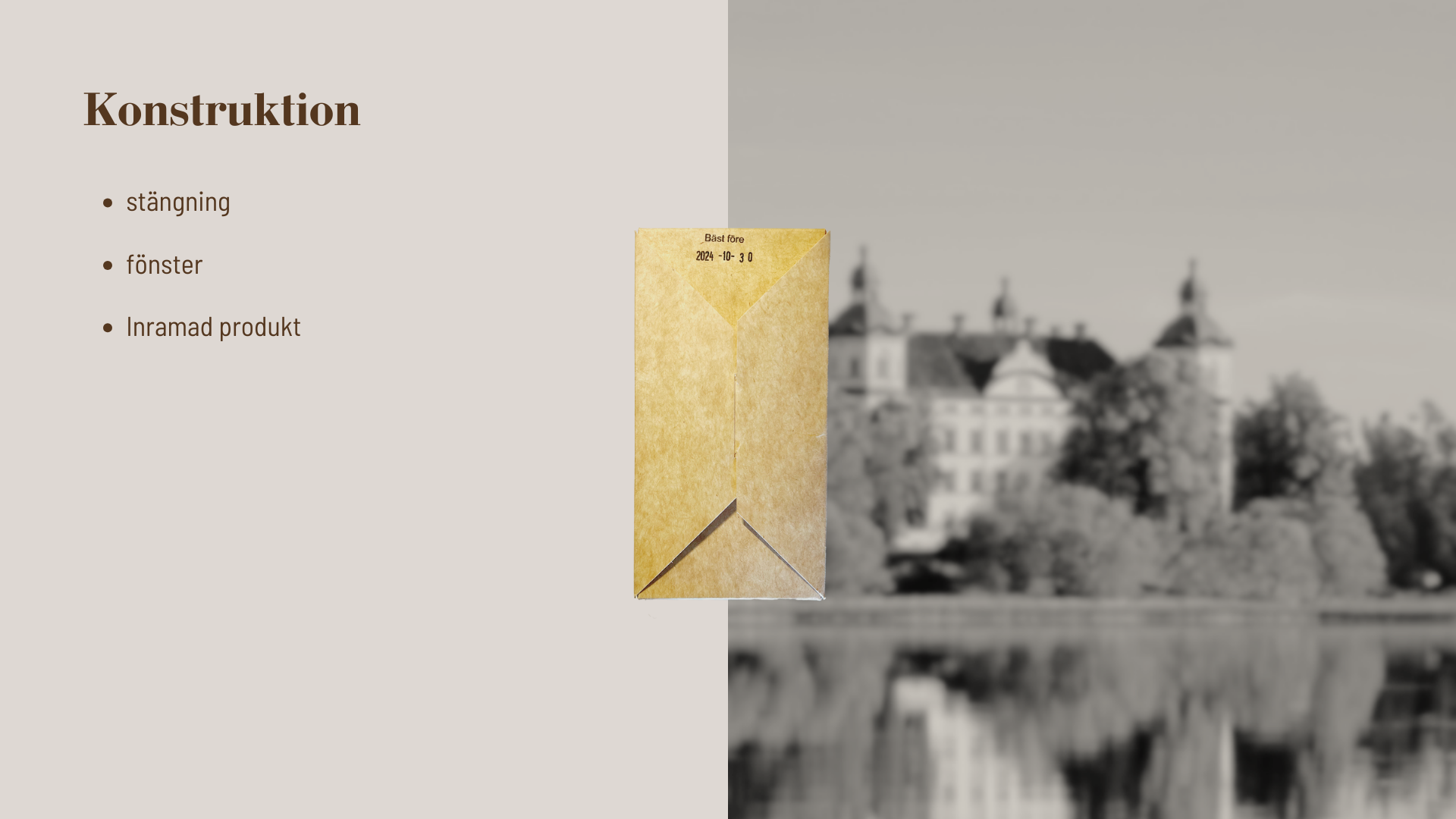
The existing packaging features a simple, functional back closure, but limits opportunities for brand communication. One challenge was to secure space for brand storytelling that reflects the brand's commitment to sustainable luxury. Another was to find a way to showcase the beautifully crafted heart-shaped chocolate bar, which was not visible in the original packaging, while highlighting its artisanal quality.
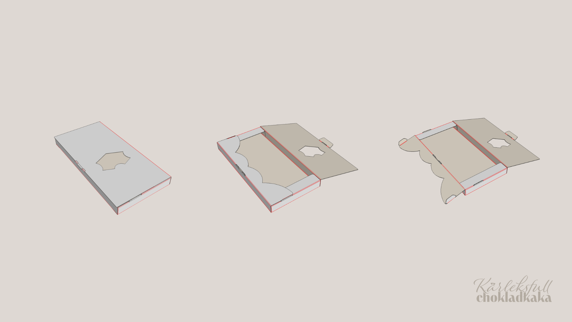
After prototyping and refining the structure in CAD, I fine-tuned the packaging details. A heart-shaped window on the front offers a small glimpse of the chocolate inside. When opened, an inner frame reveals the chocolate bar like a small work of art, making the unboxing experience feel more deliberate and special.